
CASE STUDY:
Brand strategy, naming, identity & website for a mindfulness meditation guide
From CLEAR VISION to a BUSINESS BUILT FOR GROWTH

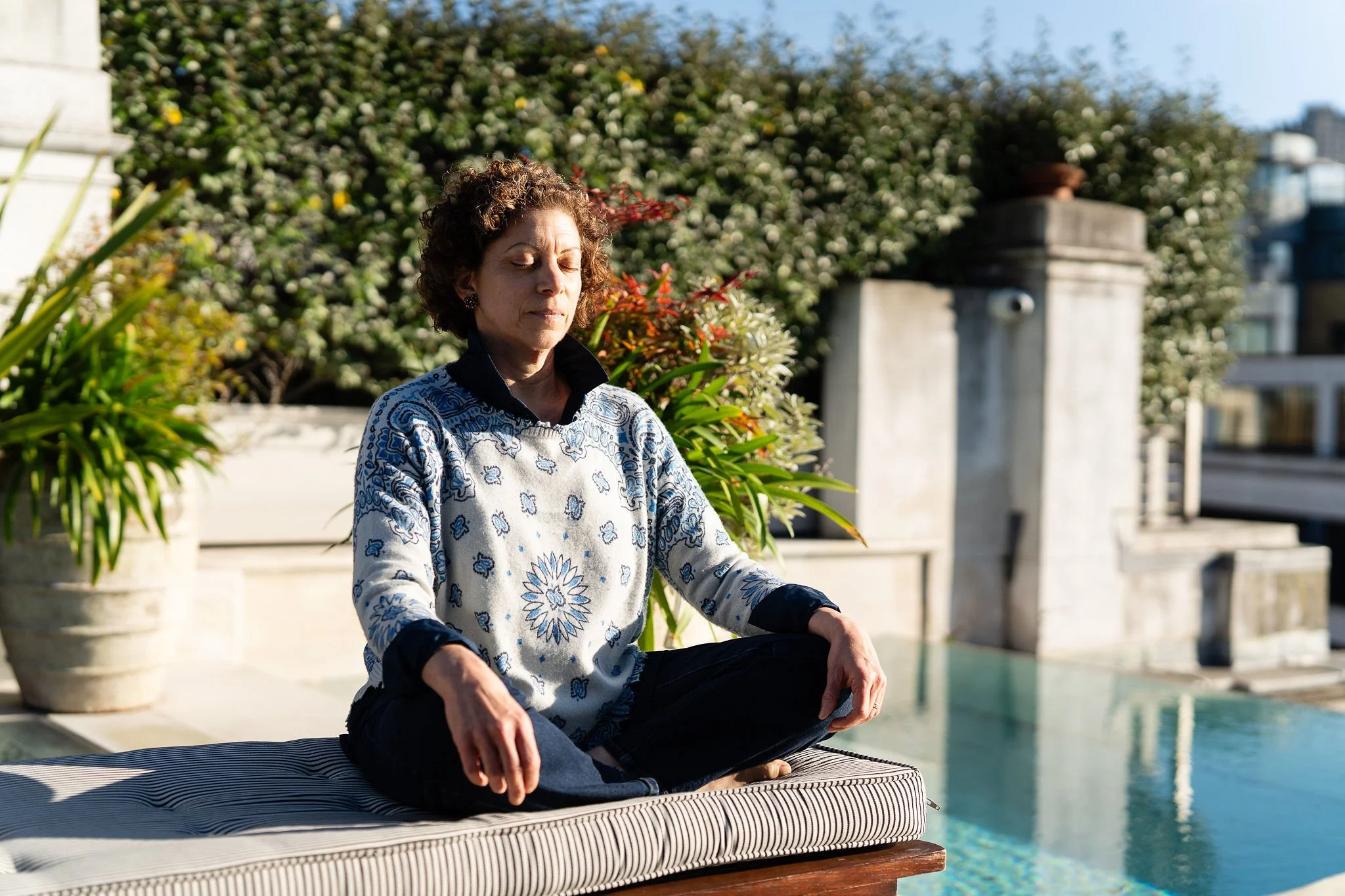
Zeina Charara is a mindfulness meditation guide who teaches from lived experience, dedicated study and nearly twenty years of personal practice. She has a calming, grounded presence and a warm, welcoming way of being with people — qualities her students notice immediately and remember long after a session ends.
Zeina came to me having already done meaningful foundational work with a brand mentor — exploring her personal story, sources of inspiration, mission, vision and core values. She had a strong sense of what she wanted her business to mean.
What she didn’t yet have were the tangible tools to bring it to life. No name, no website, no booking system, emails of past students organised in her personal contact list.
So it was time to turn those carefully tended roots into something that could actually hold and grow Zeina’s work. That way, she could move from a small side practice and become a sustainable business that could reach more of the people who needed her.
To do that, we needed to expand on Zeina’s brand concept in a few specific ways.
Her own story and what she stood for. Her ideal audience and where they were in their awareness of mindfulness. The competitive context she was working in, and what made her meaningfully distinctive within it. And the practical structure of her future business — her marketing rhythm, how she would find and welcome new clients and students, how she would actually promote, book and deliver her offers.
Begin at the beginning
We started with a Brand SourceBook. This is the document that crystallises a founder’s thinking into a working strategy and the language to support it — to be used day in and day out.
I reviewed Zeina’s earlier brand mentor work, followed up with deeper questions and a discovery interview, conducted market research, and interviewed a longtime client to capture the experience of working with her — in the client’s own words.
The resulting SourceBook gave Zeina exactly the language she needed to define and grow her business:
How to describe the value she offers and who it’s for. Who she is as a guide and a person.
How her work is different from apps, large group classes, corporate wellness, therapy, or self-guided meditation — and why those differences matter.
How to talk about the philosophical anchors and practical perspective behind her teaching.
And how to handle the most common objections (“I can’t meditate, my mind never stops”) with empathy and reassurance.
We also articulated her mission, vision and values to ground and inspire her daily work.
NAMING
the thread that ties everything together:
“Inner North Mindfulness Meditation”
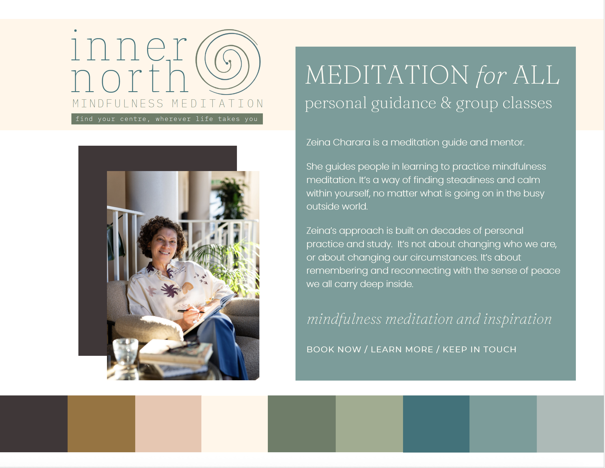
The name Inner North Mindfulness Meditation captures the essence of what Zeina values most about meditation itself: its ability to help you ground and centre yourself, no matter what’s happening in the world around you.
A twist on the compass direction true north, the name is also a nod to Zeina’s worldly personal background — originally from Lebanon, raised partly in the UK, with years spent in Saudi Arabia raising her family and working as a counsellor, before returning to London and building her business later in life.
The tagline follows naturally:
Find your centre, wherever life takes you.
I also named a corresponding, custom hybrid archetype especially for Zeina —“The Compassionate Compass,” a blend of The Sage + The Caregiver + The Explorer — to capture the personality and voice of her brand in a way she could feel.
A visual identity that feels like a deep breath:
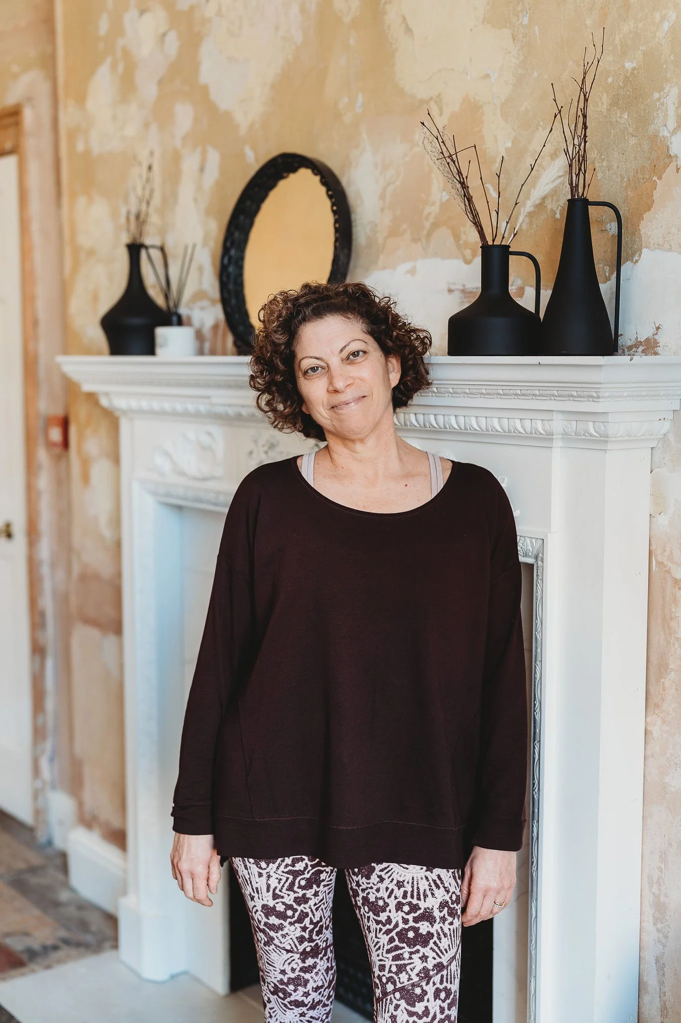
The next step was to design the visual brand identity. It needed to evoke the same warmth, light and grounded calm that Zeina’s students experience in her presence and in the spaces where she hosts them.
Zeina was drawn to the work of a particular watercolour artist, and it felt important that the brand reflect her gentle, feminine energy in a mature, sophisticated way — one that honoured her decades of earned wisdom and lived experience. The result was a muted palette in shades of robin’s egg blue, sage green and burnished gold, paired with elegant, lightweight typography and generous white space. The visual equivalent of breath.
The brief for Zeina’s brand photo shoot called for spaciousness and warmth — natural light, real presence, no zen clichés. The resulting photos paired beautifully with a carefully curated selection of watercolour stock imagery to bring the site to life.
THE WEBSITE
cornerstone of the business
With the foundations established, it was time to develop the cornerstone of Zeina’s brand and business — her website.
THE WEBSITE DESIGN BRIEFwarm minimalism
with room to breathe
With the foundations established, it was time to develop the cornerstone of Zeina’s brand and business — her website.
The website design picked up where the visual identity left off. Spacious layouts. Soft transitions. Plenty of white space — the visual equivalent of the pauses Zeina holds in her sessions.
The watercolour textures appear as quiet supporting elements rather than decoration. Zeina’s brand photography is used generously but intentionally. Calls to action are gentle invitations, aligned with the way Zeina speaks in real life.
The whole site is designed to feel like a deep exhale — a small pause in someone’s day, a place where they can recognise themselves and be welcomed exactly as they are.
Zeina’s visual identity gave us an idea of how the site should look and feel. But to create a truly effective website, we needed to start with what it would say. The words on the page are always the backbone of the user journey, and they shape every design and structural decision that follows. So we began the website phase by writing the website copy.
Zeina’s audience is broader than a single persona — and that was an important strategic point. The SourceBook had already revealed that her people share a pattern more than a profile.
An overstretched parent, a mature professional juggling responsibilities, a young adult feeling anxious about the future — on the surface they look very different.
But underneath, they’re carrying the same inner experience: wired-tired, minds that won’t quiet down, a sense of being a little too far from themselves. They’ve often tried apps, trends or quick fixes. Some worked for a while…none stuck.
The copy is structured around her clear, welcoming offer ecosystem, framed as Pathways for beginning… and beyond:
• EXPLORE — Mindful Monday, a weekly online drop-in
• ESTABLISH — Be Here Now, a four-week small-group course
• EXPAND — Path to Presence, an eight-week one-to-one programme
• DEEPEN + SUSTAIN — seasonal workshops and community gatherings
A free guided audio meditation runs through the site as a gentle entry point — a gift, a glimpse, and a way to stay in touch through Zeina’s email list.
The Inspiration page is set up to grow into a blog, with topics chosen to match what people search for when they’re first noticing they need a different approach.
SEO recommendations were woven into the copy from the start, with meta titles and descriptions written for both traditional and AI-powered search.
What they share is a readiness to try something different, and that they don’t yet have the words to describe exactly what they’re looking for.
Zeina’s distinctive value is that she’s fluent in that in-between. She doesn’t teach from a manual — she teaches from a life that’s been shaped by the practice.
Her authority comes from decades of her own practice, as well as a counselling background. But her personal presence does much of the work before she ever says a word.
So Zeina’s website needed to do two things at once.
1/ Make her work welcoming and accessible to people just becoming aware that mindfulness meditation might be a path forward (the Home, About and Inspiration pages)
2/ Make it easy for those closer to a decision to take a clear next step (the Sessions + Workshops page and the booking pages)
If your marketing isn’t clicking, it’s not because you need to try harder.THE MISSING PIECE IS ALMOST ALWAYS A CLEAR STRATEGY.Brand strategy isn’t cosmetic or superficial.
It’s functional and foundational.
It defines how people see your value and understand your work. HOW THEY REMEMBER YOU, RECOMMEND YOU, CHOOSE YOU.ONCE YOUR BRAND IS CLEAR, EVERYTHING ELSE FALLS INTO PLACE
Branding is not about making your business look shiny. A GOOD BRAND STRATEGY MAKES YOUR BUSINESS MORE STABLE.THE WEBSITE
the cornerstone of the business
“It all goes back to my messaging.
Now that that’s clearer, it’s easier to reach my audience, talk to potential clients, and keep showing up for my business in a way that feels aligned with my values.”
— HANNAH PORTEOUS-BUTLER,
PARENT SUPPORT CONSULTANT & SPEAKER —