
CASE STUDY:
Brand strategy, visual identity & website for an acupuncturist
From UNCLEAR & OUTDATED
to MORE CONNECTION & MORE CLIENTS
BEFORE
AFTER
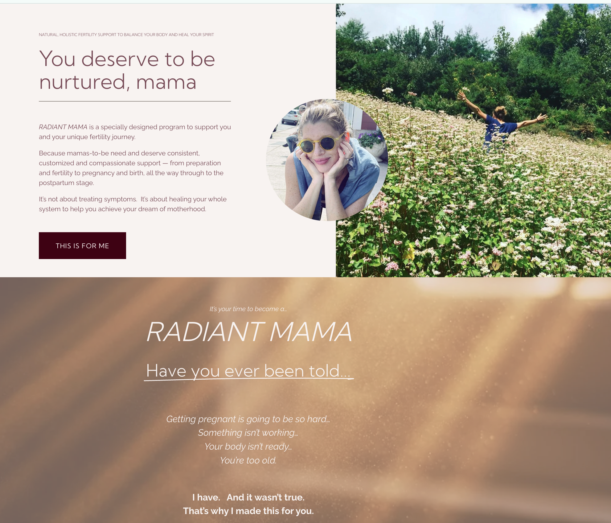
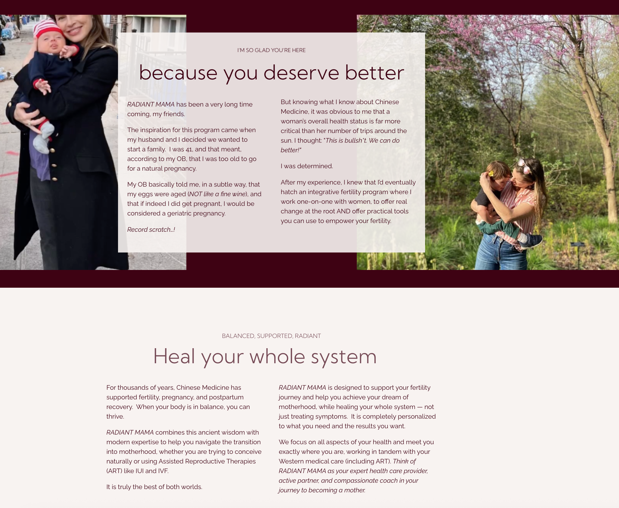
Erika Prinz Freed Ben-Zur is a highly skilled acupuncturist who needed to change up her branding, messaging and marketing to reflect her new target audience, her new geographical area, and the new way she wanted to work.
A former PR and marketing exec and lifelong ballet dancer, Erika came to acupuncture for personal use as a last resort for persistent pain. It worked to relieve the knee pain that had been plaguing her for years when nothing else (and she had tried many things) had.
Grateful and intrigued, she wanted to learn more. And more, and more. She changed career paths, studied extensively and earned many certifications and awards since opening her private practice in Manhattan well over a decade ago.
Things were good.
Then came the pandemic. And a wedding. And a baby. And urban life had lost its appeal. Eventually she and her little family resettled back in her hometown, way out in the suburbs of Philadelphia. Great for family life. Trickier to find a market for her expertise — considered “niche” at best, but, honestly, maybe a little weird by most.
In Manhattan, Erika’s clientele had been young professionals with disposable income, open minds, and a willingness to invest in themselves. In the less cosmopolitan suburbs, her prospective clientele was less aware, more skeptical, and had more demands on their budgets and free time due to family responsibilities.
Also, since becoming a mother, Erika’s interests had evolved. While still wanting to relieve those in pain, she had become deeply passionate about helping women in various stages of motherhood.
Erika needed new messaging to appeal to her new market.
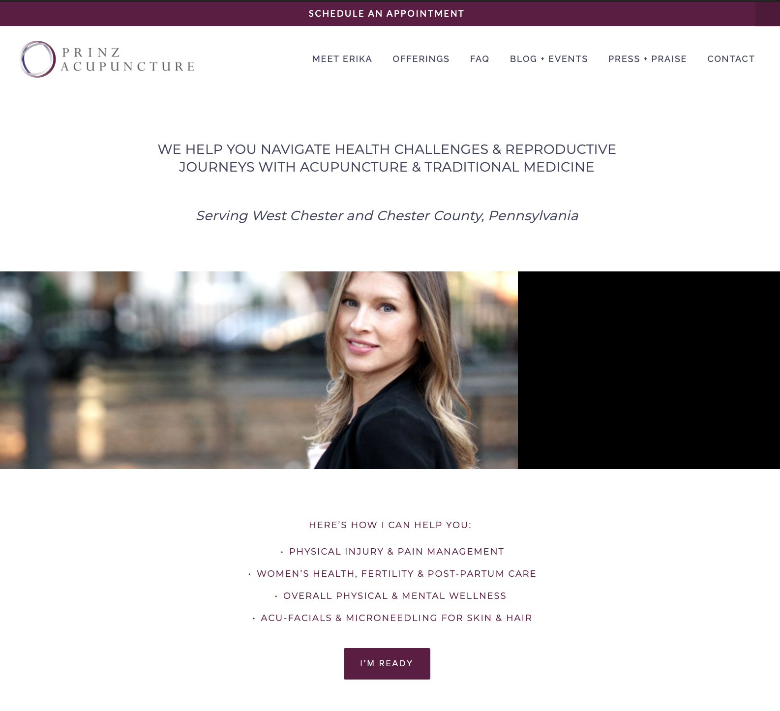
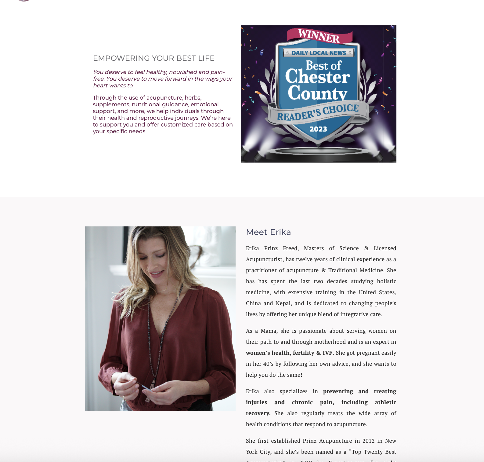
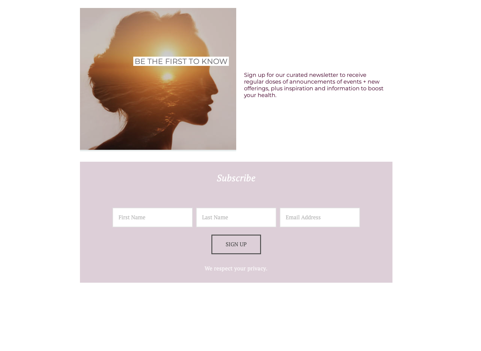
And her website needed an update. The previous version had come together over time, so it wasn’t cohesive, and it felt too corporate and clinical.
It didn’t feel like her.
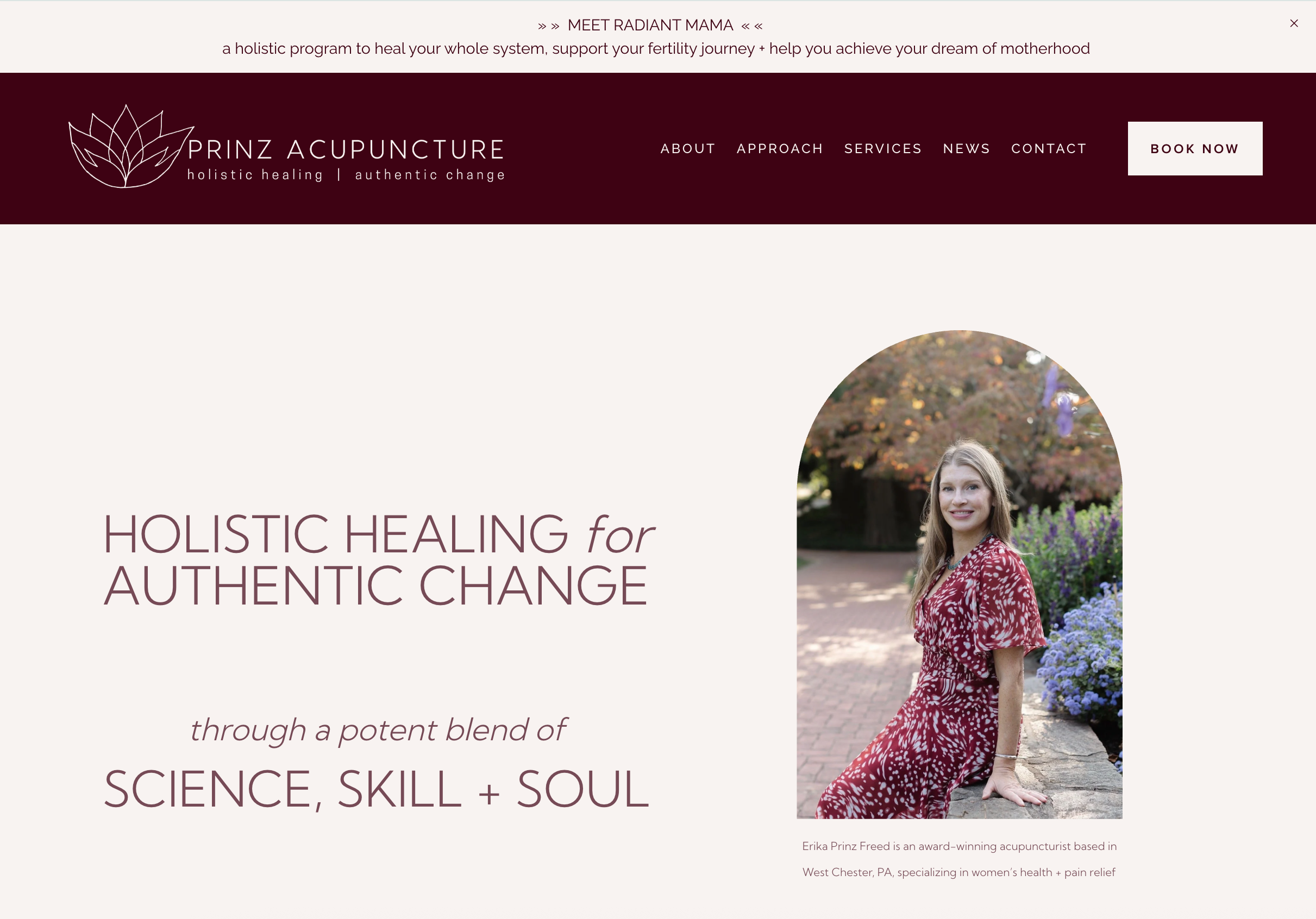
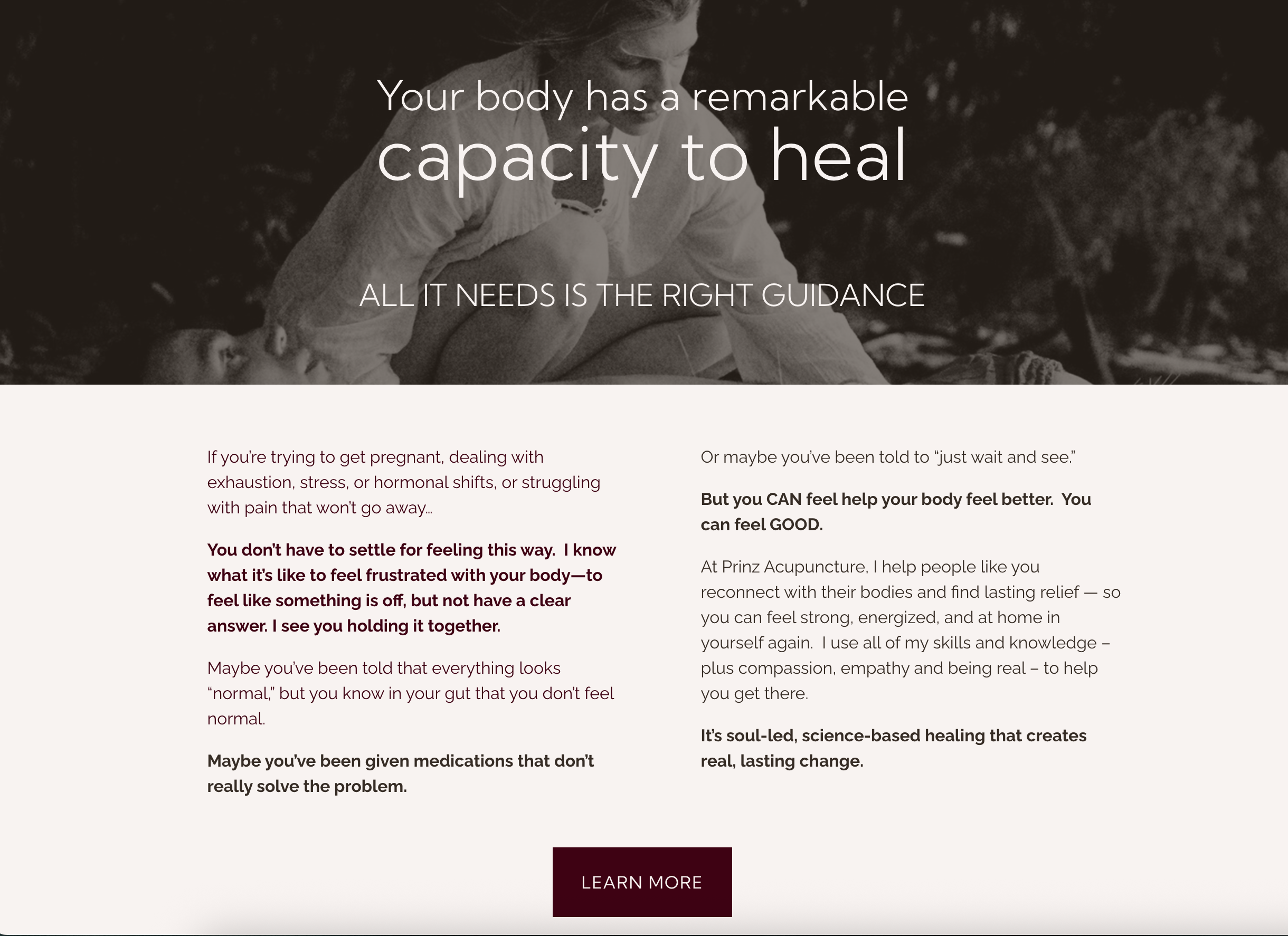
Erika wanted a website
that makes the women
she wants to help
feel like “I am
their person.”
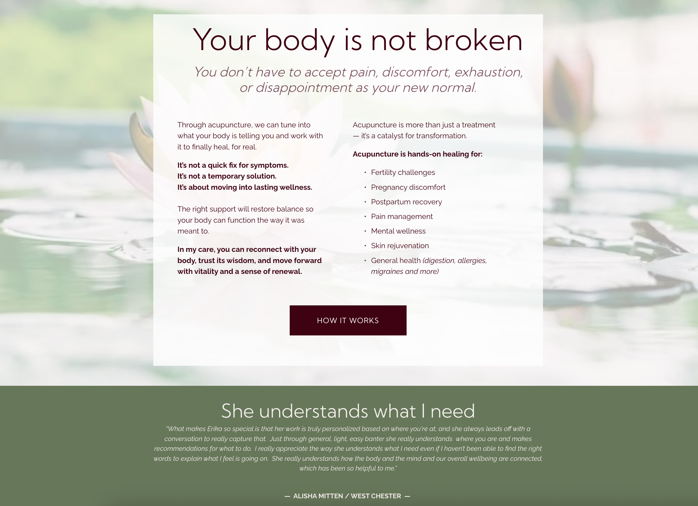
With that in mind, the perspective of placing trust back in the body can be incredibly empowering for women to hear. It’s refreshing in the face of traditional Western medicine which can sometimes feel like an endless parade of pills, injections and surface level fixes. And it’s reassuring of the inherent value of looking after oneself before there is nothing left for looking after others.
But it’s not just about acupuncture as a modality. It’s Erika’s approach in particular that makes her so well suited for her ideal client.
Erika naturally has a very grounded, feminine, nurturing presence. The way she had studied acupuncture was especially and uniquely focused on the healing power of touch. And the way she has set up her office means that she spends more time with each client so that she can offer holistic advice and complementary modalities to support her clients even more effectively.
All in the service of authentic, lasting healing and change.
We started with Erika’s messaging as the foundation for everything.
Erika’s Brand Strategy SourceBook laid out everything from her mission and vision to the specifics of her key messages and the supporting points to be woven throughout every audience touch point, from her website copy to her booking process to her blog and email marketing.
Her messaging focuses on the benefits that acupuncture offers her ideal clients, above and beyond any alternatives or objections they would consider.
Recognising that for many in her target audience life can begin to feel overwhelming and out of control — whether that’s due to fertility struggles, or the endless, multi-faceted demands of mid-life, or the way the body can seem to change beyond recognition as we get older… the science is clear – acupuncture harnesses your body’s natural ability to heal itself.
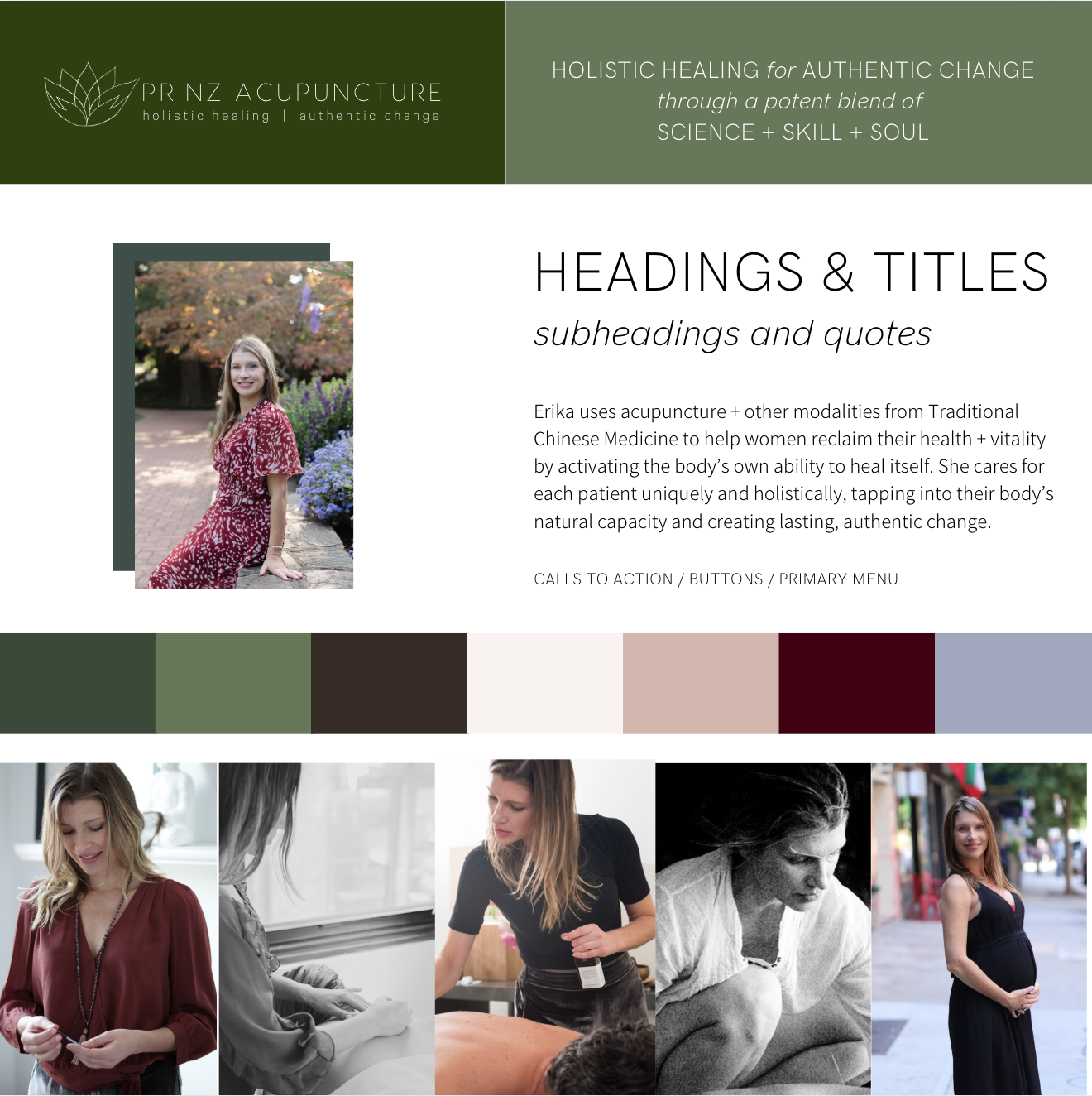
PRINZ ACUPUNCTURE
holistic healing for authentic change
through a potent blend of
science, skill and soul
With Erika’s new messaging established, we created a new visual brand identity to support it. Visual identity is what creates an audience’s vital first impression of a brand. So they must be aesthetically appealing, but ultimately they will be far more effective if they’re rooted in meaning and intention.
Erika’s brand identity would be used throughout her patients’ experience, from social media to clinic signage, but first and foremost on her website.
On a website, the eventual conversion decisions (sign up, book, etc) result from the words/messaging and user experience design (how intuitive it is to use).
But it’s the visual brand identity that creates the right first impression – encouraging visitors to stay on the page long enough to read the words.
Erika wanted her ideal website visitors to have the sense that they’d “found their person”.
Inspired by her brand messaging, her brand identity needed to balance the elements of science, skill and soul. In “voice of customer” interviews, Erika’s clients shared that they felt a deep sense of relief, and being well looked after. They loved that the clinic felt light and open, like a breath of fresh air, as well as welcoming and comfortable.
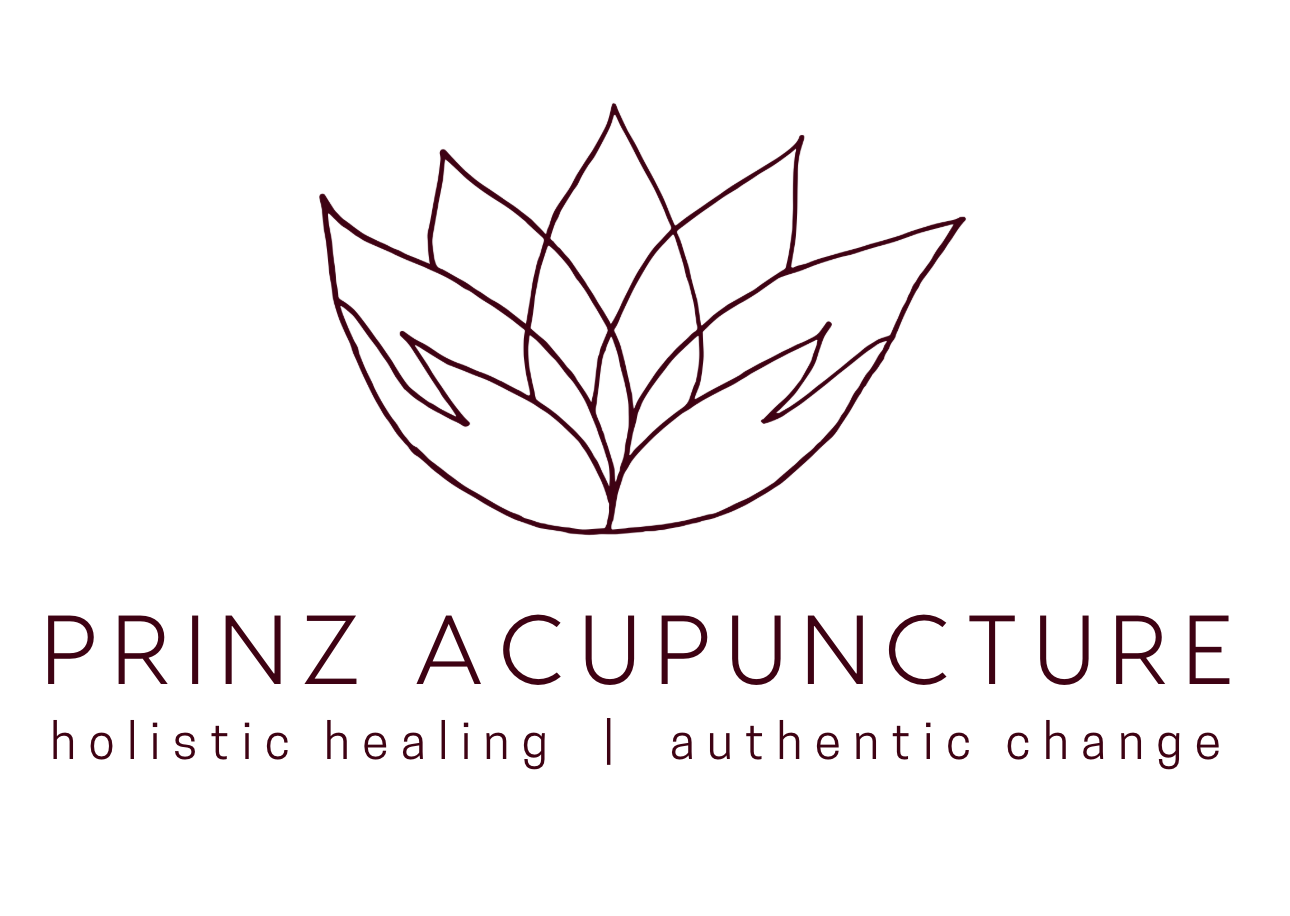
We wanted to convey a sense of nurturing touch and warm femininity — natural, grounded, attentive, modern, expert. We chose a warm, natural, feminine color palette of deep plum, sage green, creamy white and rich brown. Visuals are softly vibrant, crisp but not clinical. The typography is rounded and open, but very clean and precise. The brand mark is a lotus with petals shaped like cupped hands to evoke a sense of nurturing and rebirth, hand drawn to reinforce a sense of healing touch.
In the month following the launch of Erika’s new website in June, site traffic increased by 62%.
The search engine optimisation (SEO) efforts paid off too: visits from search doubled.
Erika shared some glowing feedback from her clients/followers:
"I love your new website! It was so interesting to hear your story and it's also beautiful.
It feels like you."
***
"After reading the page about Radiant Mama and fertility, I reached out to two of my friends to let them know that they need that ASAP."
Erika says:
“I'm definitely much more booked this summer (and especially in July and August) than last year. [I think] that people who land on my site are more prone to booking because they get the info that they need and feel a better connection to me.”
The initial numbers:
July 2024: 19 patients
July 2025: 30 patients
August 2024: 15 patients (with 1.5 weeks off work for vacation)
August 2025: 37 patients (also with 1.5 weeks off!)