CASE STUDY:
Brand identity & website for an Ecotherapist/Intuitive Counselor
Catherine Rose is an intuitive counselor and ecotherapist. Having experienced an incredible healing journey herself, Catherine now uses a variety of modalities to offer her clients a safe space and customised, nurturing guidance on their own paths to transformation.
Catherine had built her practice on personal relationships and referrals but had reached a point where she wanted to call in aligned clients more proactively and intentionally. She had had two previous websites, but neither truly portrayed who she was and the way she wanted to work now.
Catherine needed to better communicate her approach and what it was like to work with her, as well as how to take the next step. And she needed a more distinctive brand voice and visual identity that conveyed her warm, grounded, welcoming presence, reassuring and inviting website visitors from the moment they found her online.
Catherine had recently worked with a brand mentor and was full of ideas and inspiration around her story and the mission and vision for her work.
So the focus of our project was to translate this into a website that spoke to her most aligned clients while feeling true to her personality, vibe and values — a meaningful, practical tool to grow her business in a way that felt good.
I began by interviewing Catherine in depth to understand her brand voice and the way she talked about her work. Then I interviewed several of her past and current clients to find the exact words they used to describe what prompted them to seek out Catherine, what it was like to work with her, and the transformation they experienced.
I mapped these insights to her business goals to create her website strategy and structure, as well as refine her offer ecosystem. Then came the copywriting, using Catherine’s tone of voice and the voice of customer data to inform the messaging strategy and specific word choice.
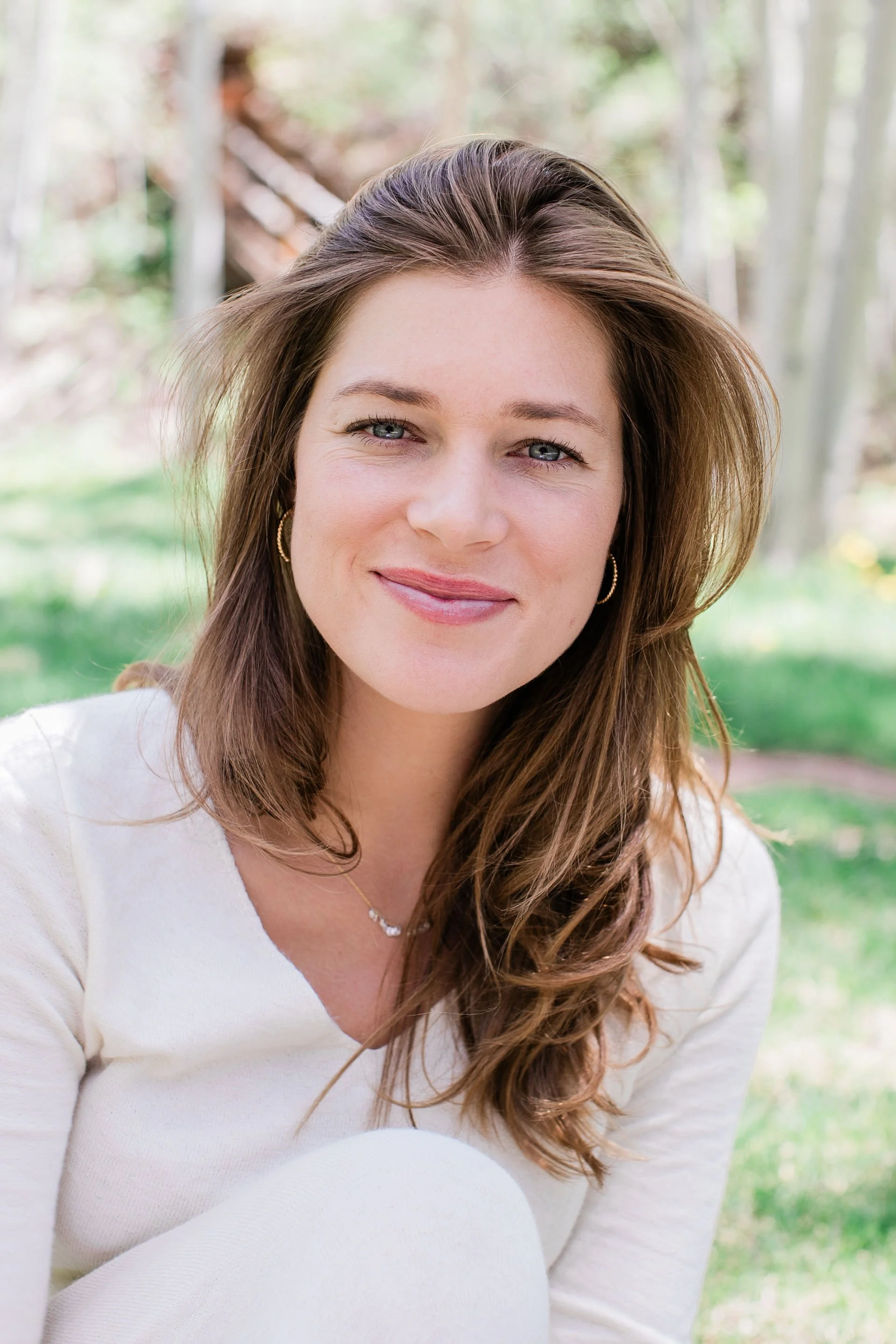
I also created a visual identity for Catherine to anchor the initial impression conveyed by the website. With the logo suite inspired by a custom-created botanical illustration that perfectly captured her approach, Catherine’s visual brand identity (typography, colour palette and photography style), is soft, feminine and earthy. I edited a selection of Catherine’s own nature photography so it would feel cohesive when used throughout the site, complemented by a fresh brand photoshoot done by a close friend of Catherine’s.
The result is a site that flows intuitively, reflects Catherine’s approach and personality, and clearly invites her most aligned potential clients to take the next step towards healing and transformation.

